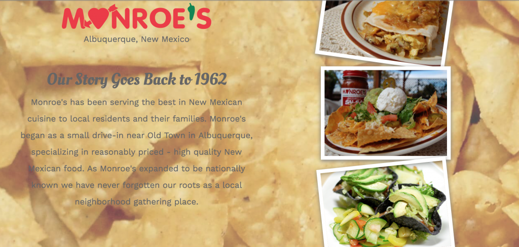
Monroe’s wanted an updated site with a modern look that focused on their long history and famous chile.
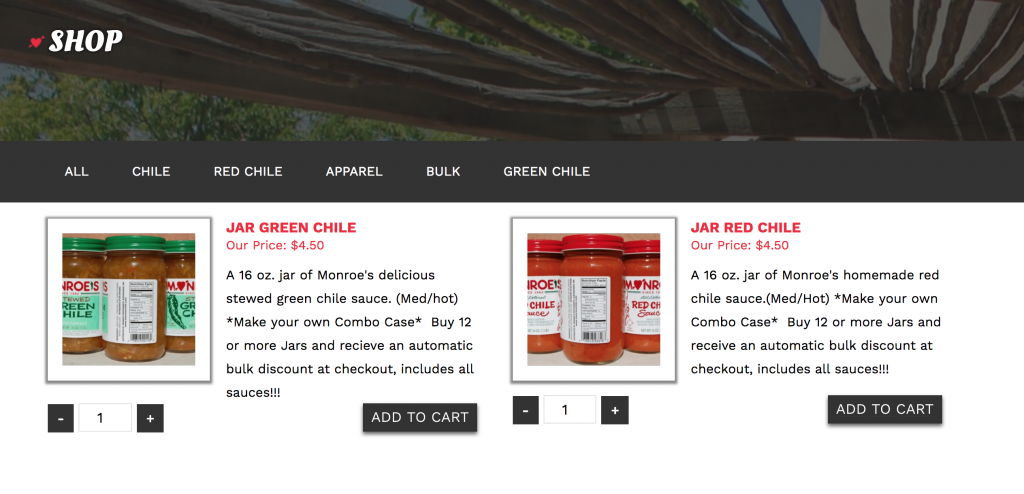
Monroe’s previous site was a standard single column site that had a separate mobile subdomain, a technique that has since been mostly forgotten with the rise of responsive web design. They also had an embedded shop that was technically not apart of the site itself. Our goal was to make a design that would work well across all screen sizes, throw in some interactivity where we could, and supply them with a real shop that they had full control over.
We wanted to create something that had a modern layout, but held on to their history. Our main influences for this design were based around 60s era Albuquerque, mixed with the feel of a diner. We made some design choices to inject this bit of history via the fonts throughout the site, some background images and textures where applicable.

We laced each image with a Polaroid-style outline to add to the historical vibe. As a hint of fun, we also added some randomness that changes the position of a stack of images on the home page every time you visit the site. This creates an interesting overlap that looks as if someone tossed a handful of images on the screen.

In terms of new features: the new menu is now a live filterable menu showcasing each item by its category. The recipe pages held on to the old sites usage of a paper-like background, but is laid out in an easy-to-read fashion and offers a lot of control in terms of content. We also added a fully featured calendar for Monroe’s to showcase food specials and events. Last, but not least, you can now head over to the site to buy a case of chile or merchandise!
Are you interested in getting a website built around the unique style that sets your business apart from the rest? Contact us here.