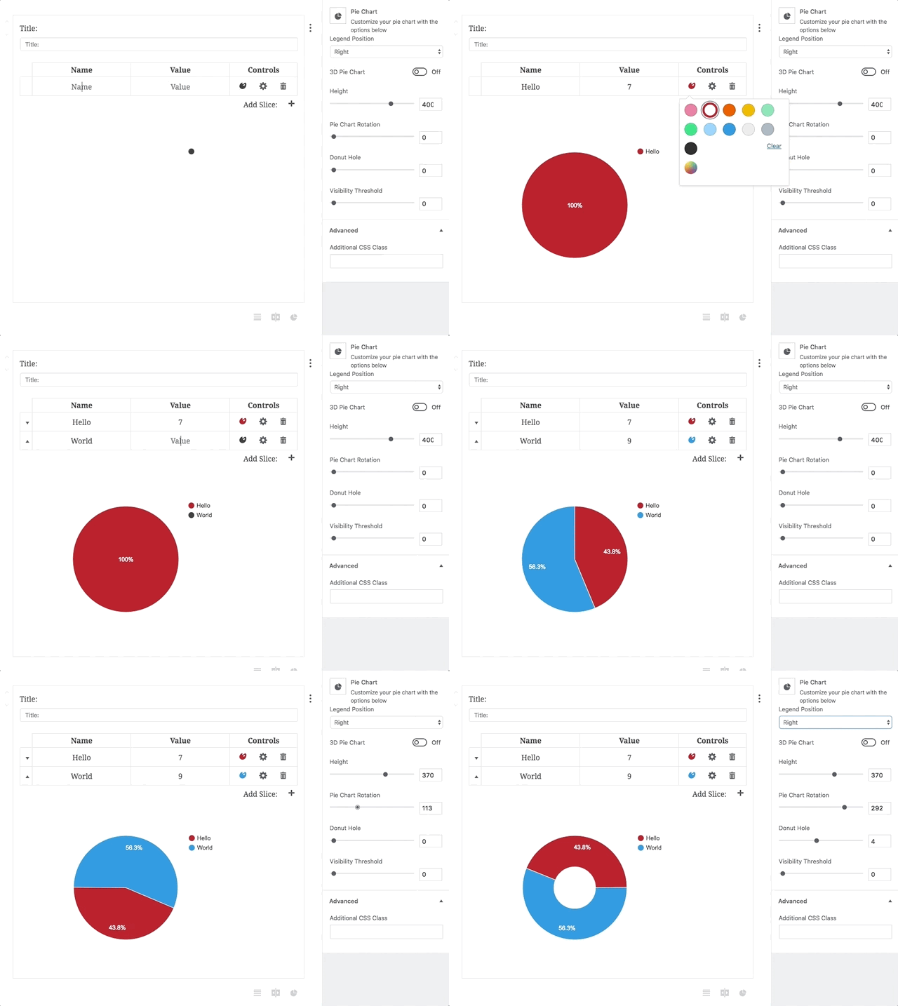
I’ve been working with Gutenberg quite a bit over the last few months (shameless plug for Block Party, our Gutenberg block store) and I’m pretty excited for it to be merged into core. It’s a much better experience overall for end-users and I’ve enjoyed making some truly interactive Gutenberg blocks.

Block Party Pie Chart
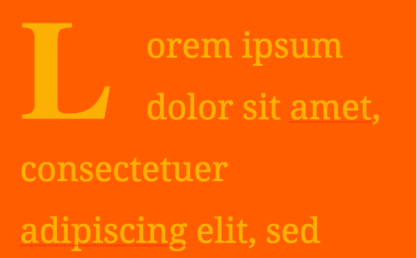
I’m also excited to switch to making all new client sites in Gutenberg. I’ve shown Gutenberg to some of our clients and they can’t wait for the next iteration of their sites to be built in the block paradigm. But there is also a major downside to Gutenberg as it is now: too much freedom. Here’s a default paragraph block styled as horrendously as I could:

Super ugly Gutenberg paragraph block
Now, some end-users (blog writers, for one) will love that kind of freedom. But I’m mostly concerned with building sites for businesses with branding guidelines that may have several employees entering content. If companies have strict branding guidelines, Gutenberg’s default freedom is a major concern. So how do we build a site in Gutenberg that allows for interactivity and a true WYSIWYG experience while always staying 100% on brand and looking great? I’d like to share the approach we are planning on taking.
Goals
- Have all blocks look 100% on brand
- Allow an easy editing experience where all options are discoverable through the editor (no remembering class names, etc.)
- Allow each block to have several variations
Strategies
- Remove block level styling
- Using a class dropdown for many of the block variations, class styling handled in the theme
- Allow for variation in layout also via a dropdown
Remove Block Level Styling
As of mid-May, you can’t turn off options or add custom ones in the default Gutenberg blocks. Hopefully this will change in the future – until it does, we are planning on unregistering blocks that can break branding guidelines and replace them with our own custom ones. These will largely be the same as the default ones with fewer options.
Using Class Dropdowns
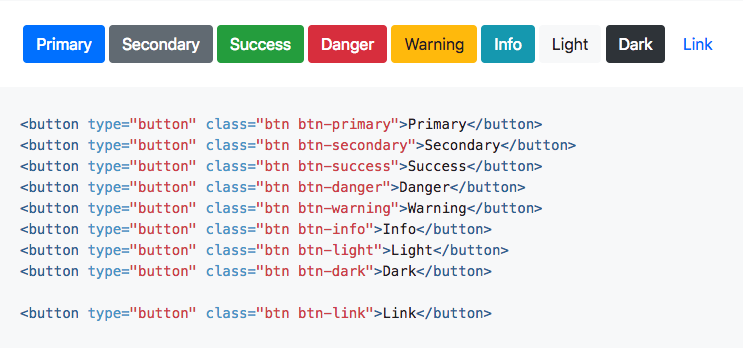
If you’re familiar with front-end frameworks like Bootstrap or Foundation, you may already be familiar with this approach. Instead of allowing users to just make changes to styles, we can give them predefined classes which would change the styling of the block. As an example, we can look at Bootstrap’s buttons:

You can use a variety of button styles simply by invoking a class, like btn-primary. We wouldn’t show the user the class, but the dropdown could contain choices like primary, secondary and others. Then our theme would handle the styling for each of those classes, again keeping everything easy for editors and always on brand.
Layout Variations
In the same vein, most layouts will have a variety of options. Let’s imagine a template with a full-width section, with an image and some text next to it. We can still use the same class approach for text color, background color, etc. But we could then add another simple option: “Image first” or “Text first” or whatever other layout the client wants. These layout options would change the HTML outputted by the Gutenberg block, but styling would still be handled by the theme.
Conclusion
I think there’s a fair amount of work for us to do here. We’ll need to create several blocks to both complement and replace the default blocks. We’ll need to update our starter theme to have a skeleton of primary and secondary styling. But I’m excited to get going – and I think the end result will be a much better experience, both for content creators and businesses trying to stay on brand. I’d love to hear about different approaches and why – let me know in the comment section below.
— Eric Debelak
Thanks for the post! I watched a few of your WC talks and appreciate your approach for adhering to brand styling. Gutenberg is amazing but has far too many customizable options by default. I really appreciate your solve for button styles.
One struggle that I have been having is how to get bootstrap classes such as .container , .row , and .col to line up with the Gutenberg editor backend and the front end. Specifically .col does not seem to want to play nice with the default css classes in the editor. Have you figured out a way or pattern to get the styles for these to carry over?
Hello Steven,
You are welcome!
I’ve also had a hard time getting some styles to work well with the editor. I’ve had to create a bunch of custom css rules to accommodate a better editing experience. Hopefully, this will get better over time. Sorry that I don’t have a better solution!